Beauty by Bie CRO Audit & UX Redesign.
RoleUX/UI Designer · CRO Strategy & Redesign
ObjectiveIdentify what’s getting in the way of conversion and redesign the experience to make every step feel easier.
Key focus areasVisual hierarchy, Value communication, Category discoverability, Mobile navigation, Information scent, Usability
Impact
Live Preview↗
After one month with the redesign live, more visitors added products to cart, fewer left right away, and people stayed longer.Sep 1–Oct 31, 2025 vs. Nov 1–Dec 31, 2025
Add to cart rate+59%5.37% → 8.57%More visitors reached the cart
Bounce rate−5%83.2% → 79.42%Fewer visitors left on the first page
Avg. session duration+28%40.51s → 51.81sPeople spent longer exploring
The homepage opened with atmosphere, but not with direction.
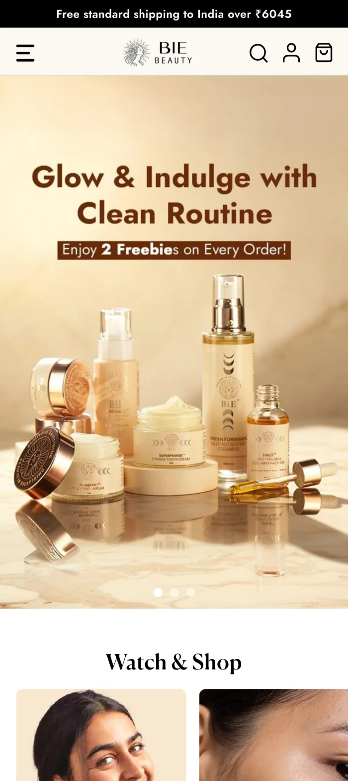
Original homepage · observations
CRO Audit
01
Visual hierarchyThe hero carries decorative weight but no dominant message or action; users scan without a clear next step.
02
Missing USP communicationBelow the hero the page moves straight to content. Nothing states what the brand stands for or why to trust it.
03
Category discoverabilityNo category entry points near the top of the page; Product range was only reachable through the hamburger menu.
04
Mobile navigationSearch, cart and account live only in the header, so every action costs a scroll back to the top.
Redesigning the Homepage
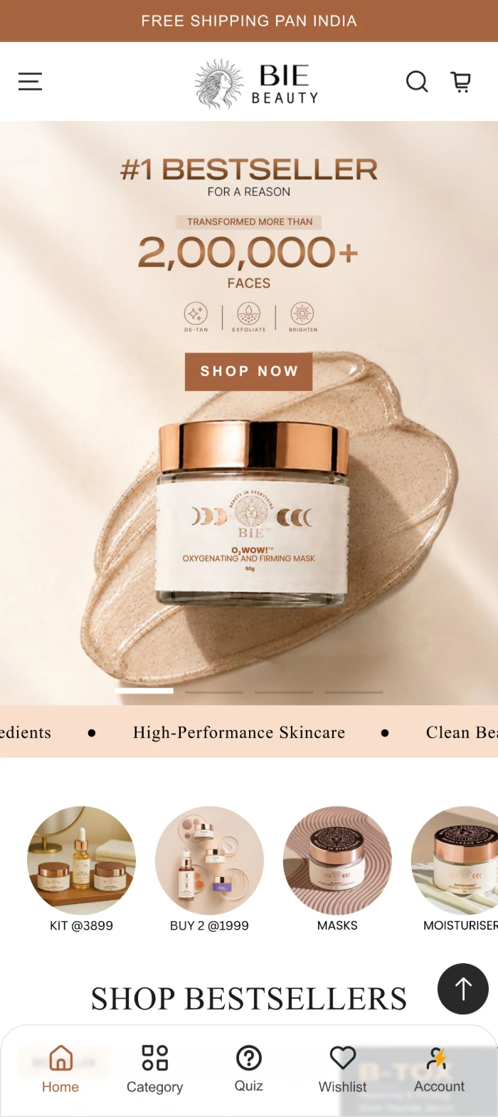
Before
After01
01 · Strengthening Visual Hierarchy
One message, one proof point, one action.
Why it mattersA clear hierarchy lets users scan the first screen along natural Z-pattern movement and locate the proposition before they decide to scroll.
Intended effectDesigned to reduce cognitive load on entry and create a clearer path toward product discovery from the first screen.
02 · Making Brand USPs Visible
Stating the proposition where attention already is.
Why it mattersA concise strip lets users understand why to consider the brand with minimal effort, and supports confidence before any product decision.
Intended effectExpected to reduce the effort needed to understand the brand proposition and to improve information scanning on the way into the catalogue.
Before
After02
Below the hero: straight into content, no value statement.USP strip sits immediately under the hero.
Before
After03
Category access sits behind the menu icon only.Top categories, one tap from landing.
03 · Improving Product Discoverability
A route into the range, above the fold-and-a-half.
Why it mattersEarly category entry points communicate the breadth of the offering and let users enter the category that matches their intent.
Intended effectSupports faster product discovery and reduces navigation friction by removing a menu interaction from the shortest path to a category.
04 · Improving Mobile Navigation
Key destinations, always within thumb reach.
Why it mattersPersistent navigation removes repeated scrolling, and a clear active state tells users where they currently are in the experience.
Intended effectReduces navigation effort, provides persistent orientation, and applies a familiar app-like pattern mobile shoppers already know.
Before
After04
No persistent navigation at the bottom of the screen.Sticky bar with five destinations and an active state.
Before
After
01
02
03
04
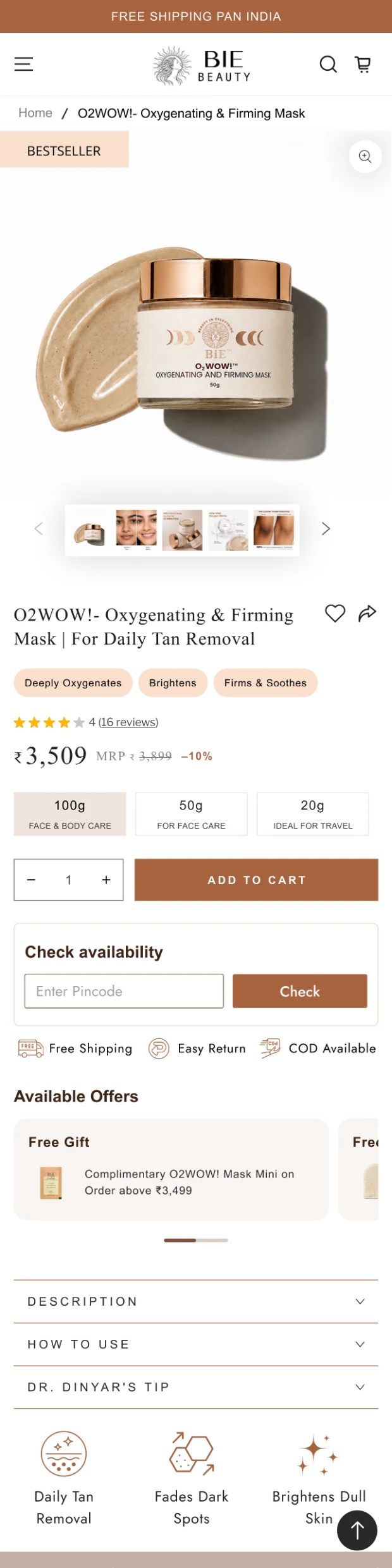
Before. Atmospheric but undirected: one visual block, no stated value, no category entry, no persistent navigation.
After. Directed: a hero with one action, stated USPs, category entry points, and navigation that stays with the user.
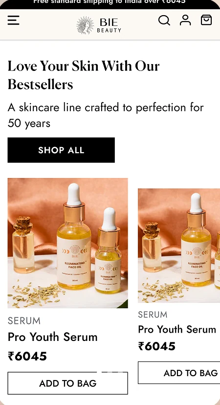
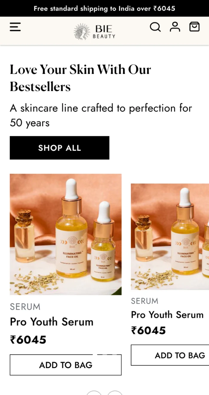
Original cards · observations
Product Card Audit
01
Badges & product tagsNothing signals which products are bestsellers, new or featured while the user scans the grid.
02
Reviews & ratingsNo rating or review count on the card; social proof lives only on the product page.
03
WishlistNo save-for-later action, so undecided shoppers have no low-commitment next step.
04
Discount offersA single price with no MRP or saving, so promotional value is not identifiable while browsing.
05
Card consistencyAdjacent cards render at different sizes, breaking the grid's rhythm and making comparison harder.
From displaying products to helping users evaluate them.
Each card observation and the component change it produced, the same finding-to-response structure as the homepage.
Before
After
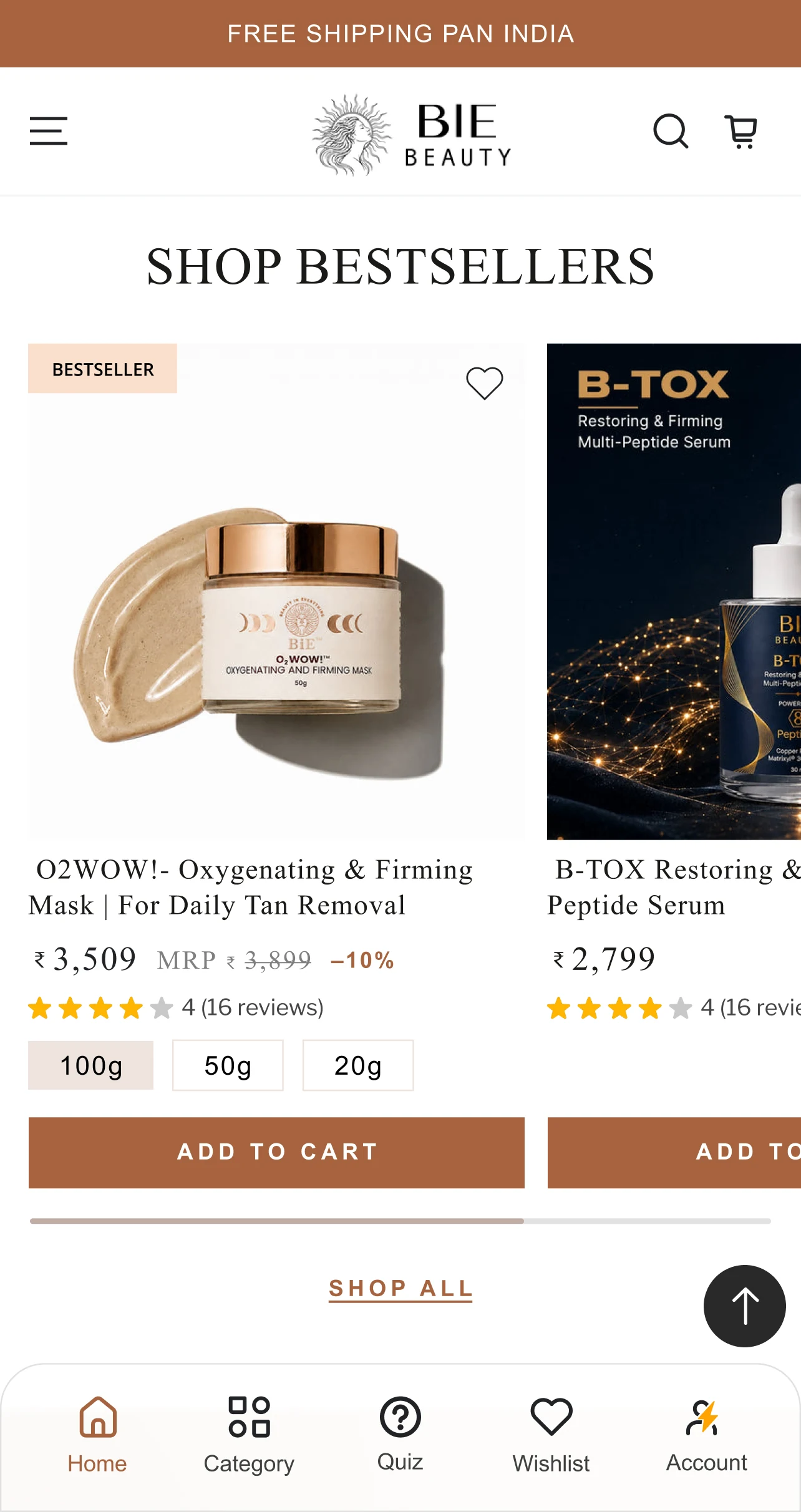
Product Card · Before & After
Five changes to one component.
01Product badges. Surface product relevance at a glance.
02Social proof. Bring product credibility into the browsing experience.
03Wishlist. A low-friction way to save products for later.
04Offer visibility. Make product value easier to identify while browsing.
05Card consistency. Standardise the component for a predictable grid.
Every card answers what a shopper asks, in order.
01 RecognitionProduct image + nameWhat is this?
02 RelevanceBadge / tagIs it worth my attention?
03 Social proofRating + reviewsDo others trust it?
04 ValuePrice + discountWhat does it cost me?
05 SelectionVariants, where applicableWhich one do I want?
06 ActionAdd to cartTake it.

New feature
Take the Skin Quiz
UX rationaleHelps users quickly identify products suited to their specific skin concerns, reducing decision fatigue and making product discovery more guided and personalised.
CRO rationaleMoves users from browsing individual products to a personalised routine recommendation, creating natural cross-sell opportunities and supporting higher basket value.
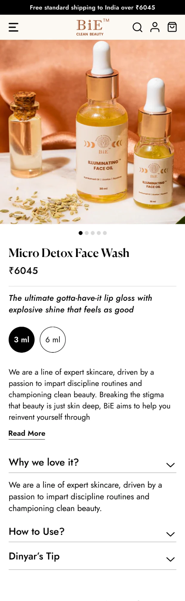
Original PDP · observations
Product Page Audit
What’s missing?
OrientationNo breadcrumb trail, so users cannot see where they are or step back to the category they came from.
Product imageryA single swipeable image with dot indicators, no zoom and no thumbnail gallery, so additional views are easy to miss.
EvaluationNo ratings, no review count, no product USPs. Benefits are buried in a paragraph behind a Read More.
ValueA single price with no MRP or discount, and no visible offers at the point of decision.
Purchase actionNo prominent Add to Cart in view, and nothing persistent as the user scrolls the page.
ConfidenceNo delivery estimate, no shipping or returns information, and no way to save or share the product.
Giving the page everything a purchase decision needs, in the order it is needed.
The redesigned PDP in full, split across two panels, with all eleven changes marked in place, each tied to the observation that prompted it.
01Breadcrumbs. Shows current location and enables easy backtracking to related pages.
02Zoom interaction on imagery. Lets users inspect detail closely, reducing purchase uncertainty.
03Thumbnail product gallery. Makes multiple product views discoverable rather than hidden in a swipe.
04Wishlist & share actions. Supports engagement beyond the immediate purchase journey.
05Product USP chips. Key benefits become scannable instead of buried in body copy.
06Ratings & review count. Social proof builds credibility and supports an informed decision.
07Price, struck-through MRP, discount. Makes the value of the purchase immediately legible.
08Sticky Add to Cart CTA. Keeps the primary action accessible at every scroll position.
09Estimated delivery checker. Sets delivery expectations upfront, reducing uncertainty at purchase.
10Shipping & returns highlighted. Free shipping, easy returns and refunds reduce purchase hesitation.
11Available offers near the CTA. Promotional benefits are discoverable at the moment of purchase.
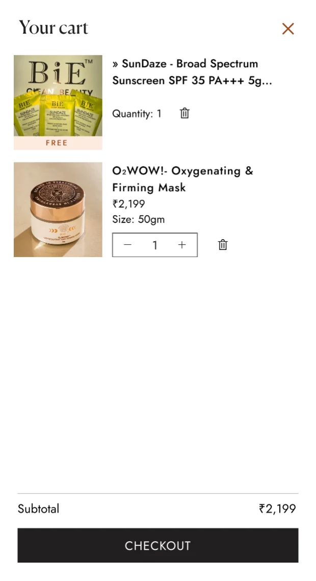
Cart Drawer Audit
A cart that totals the order, but never argues for it.
No incentive signalNothing tells the user how close they are to free shipping or an offer threshold.
No cross-sellThe empty space between items and CTA carries no complementary product suggestions.
No trust markersNo secure-payment indication at the point where payment details are about to be requested.
No value summaryA subtotal alone; the discount already earned on the order is never stated.
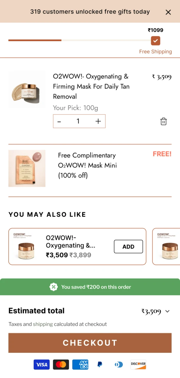
Cart Drawer · Finding → Design Response
Progress, cross-sell, savings, security.
Four additions to the drawer, each one working on the checkout decision.
01
Progress bar toward free shipping or offerClearly communicates how close the user is to qualifying for free shipping or a 3% discount, making the threshold actionable rather than invisible.
02
Frequently bought togetherSuggests complementary products at the point of review, encouraging additional purchases and supporting a higher average order value.
03
Total savings messageA stated “You saved ₹200 on this order” lets users see the value of the basket instantly and reinforces the benefit of the discounts applied.
04
Secure payment markersRecognisable payment options build trust, reduce concerns about fraud and support completion of the transaction.
From audit to impact.
Oct 2025CRO audit
Nov 2025Changes live · 1 month observed
Dec 2025Results measured
Add to cart rate+59%5.37% → 8.57%
Bounce rate−5%83.2% → 79.42%
Avg. session duration+28%40.51s → 51.81s